Logo design for a finance blog.
Modern Moneygrubber is a finance blog that follows the stock market’s ups and downs during the COVID-19 pandemic. The client desired a logo that reflected the blog’s content and suggested the design could “have something like a moneybag”. I explored ways key words such as money, finance, and stock market could influence the final design. This was one of my quickest turnarounds for a logo design; I completed researching, sketching, and designing within 3 days.
You gotta come up with many bad ideas until you find the right solution.
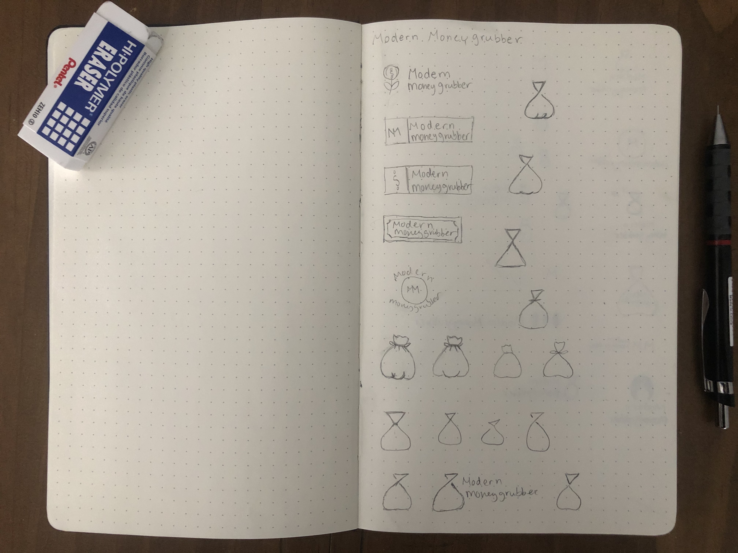
After the initial briefing with the client, I left with an understanding that the logo needed to be minimalist, contain shades of green, and potentially feature a moneybag. I spent the next hour gathering minimalist design inspiration, and then put my pencil to paper and began sketching.
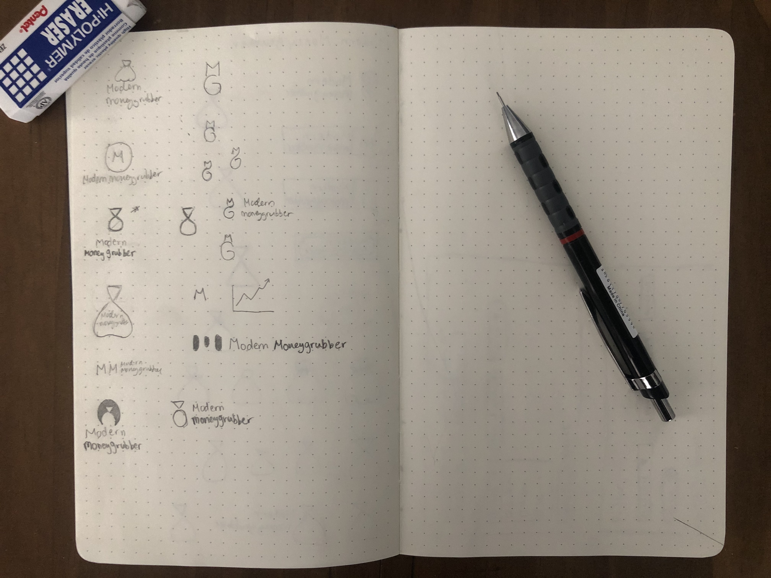
My initial sketches explored literal representations of money with the logo being incorporated in a rectangular shape similar to a dollar bill. The sketches were looking a bit too on-the-nose and didn’t fit with the minimalist vibe. I then transitioned to abstracting a money bag in attempt to create a logo mark, but the more I abstracted the more it looked like a chemistry vial - not what I was going for!
I stepped away from my sketch pad for a bit, and when I returned I began playing around with different ways to combine some of the letters in Modern Moneygrubber. The letter M’s angles reminded me of a stock market graph. Given that the blog focuses around the wild fluctuations in today’s stock market, I pushed the abstraction of the letter further to represent both the blog’s title and its content. Sometimes, you gotta come up with many bad ideas until you find the right solution.


Moving to the computer and final touches
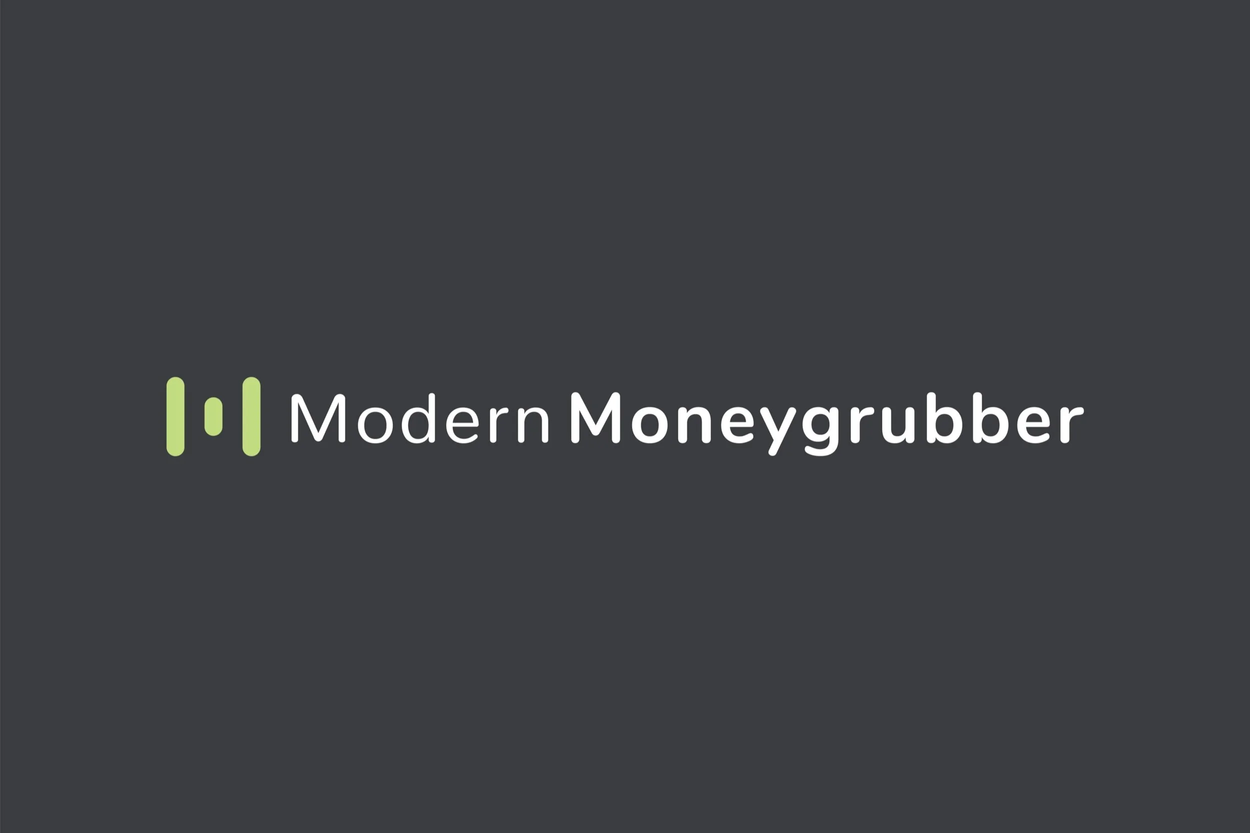
Once I settled on the logo mark combining the stock market iconography and the letter M, I opened up Illustrator to begin the process of transitioning pencil to pixel. This phase was spent mostly fiddling with typefaces and how to display the typography in comparison to the logo mark. I resolved to display the typography horizontally since the logo will mostly be used on a website’s header.
I wanted a typeface that complemented the rounded geometric shapes in the mark. After many variations, I decided to use Nunito because not only did the rounded lettering complement the mark, but the typeface is a Google Font so the client could use it throughout his site.
After selecting a typeface, I began exploring color palette variations. Naturally, I leaned towards shades of green due to the blog’s monetary qualities. In the end, I applied a bright green gradient to the mark and paired it with dark gray typography. The bright green is invigorating and represents wealth, while the gradient makes the logo more modern and playful. Instead of a traditional inverted logo, I decided to apply lime green to the mark while leaving the typography white.


