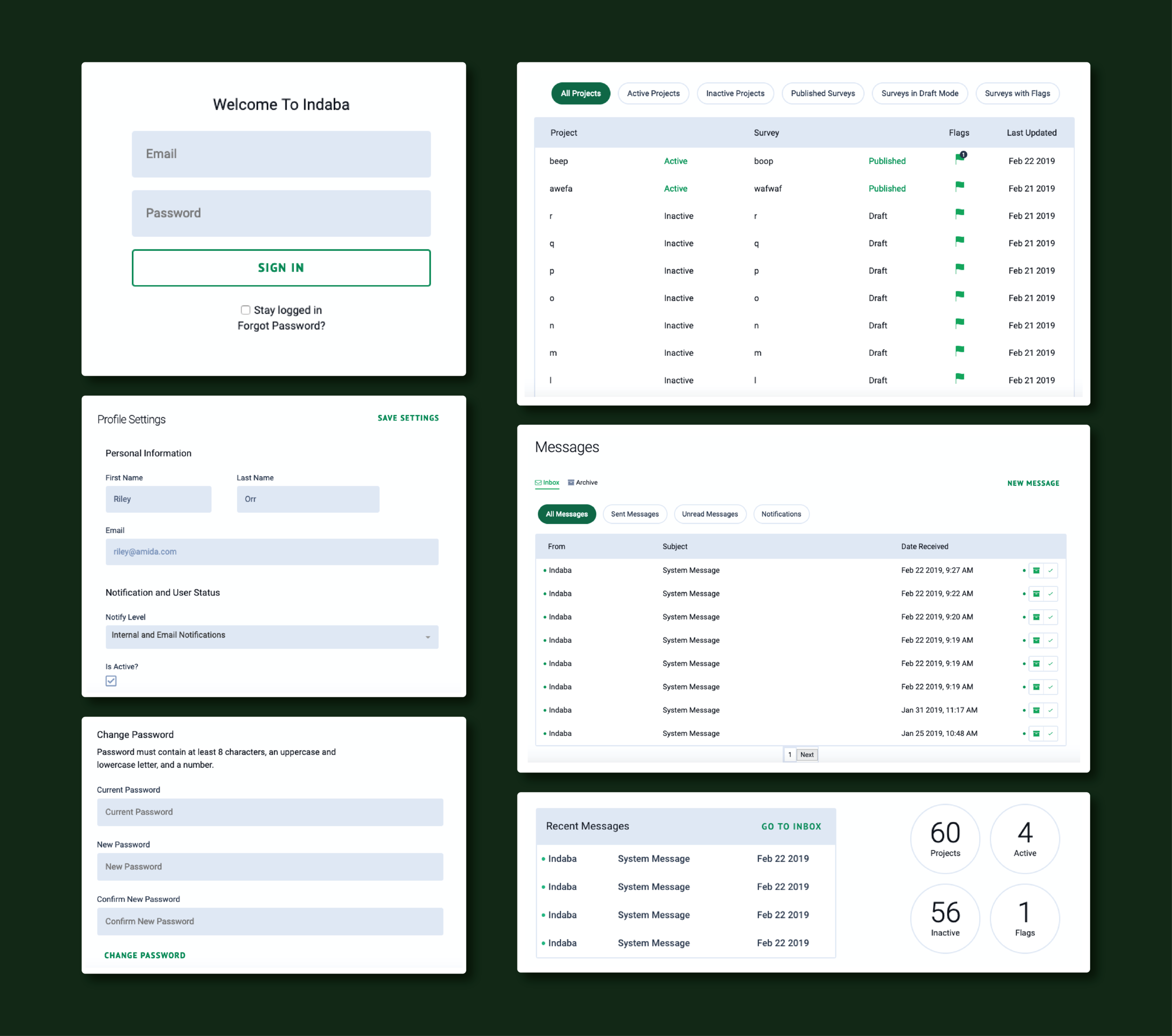
Components should be consistent.
Indaba is a product that allows folks to set up customized surveys; however, there was no standardized styling utilized throughout the app. I had the opportunity to revamp the tool’s UI while applying accessibility best practices. Once uncovering all of the tool’s inconsistencies through inventorying all assets, I worked with a frontend engineer to traverse hundreds of lines of code to update components and elements to follow a standardized format that met accessibility standards.
The typography throughout the product varied in shades of gray and rarely passed color contrast ratio tests. The image on the left shows the login screen’s original UI, while the right is the updated design. It’s a common pattern for emails and password fields to be required when logging in, so we opted to remove the ‘required’ string from both inputs.
Indaba’s dashboard displays a table containing recent messages in addition to information about active projects and surveys. The updated styling was applied to both elements. However, we did not have the bandwidth to fix the padding issue between the table and the badges.
The tool’s dashboard also features a table showcasing all the projects and surveys attached to a user’s account. The original table was extremely difficult to read and contained many padding issues. I regret not naming the updated table’s project names the same as the original project names for comparison purposes.
Takeaways
I learned a lot throughout this quick UI update project. Many times I work on end-to-end products, so it was an interesting learning experience updating existing UI components. I also honed my HTML and CSS coding by applying many of the style changes myself. There are many ways to improve Indaba’s UI beyond applying consistent styling, and hopefully that’ll be a future endeavor.


